|
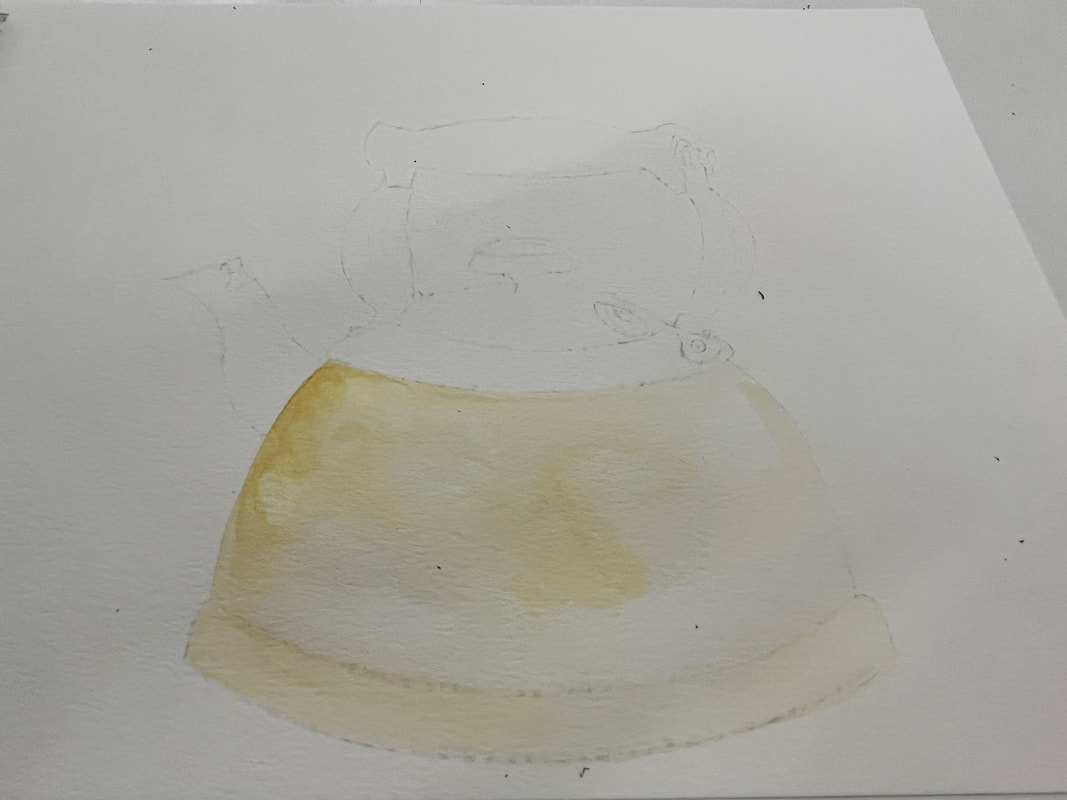
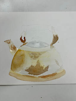
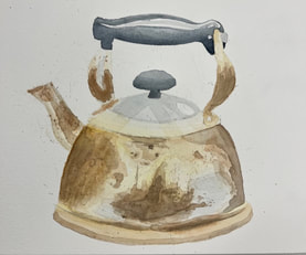
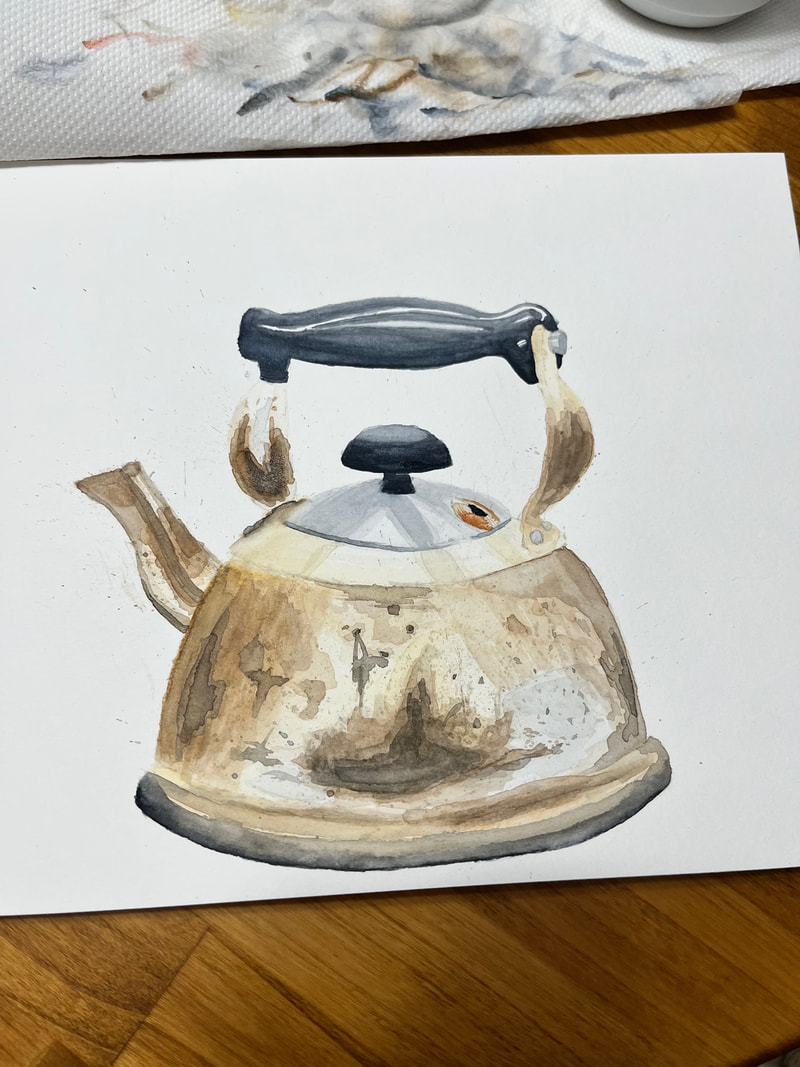
For my drawing class were were working on still life sketches and I chose the most intricate, time consuming object to draw, along with two other objects. "What object" you might ask? well a dang tea kettle of course! As it is my final project, I wanted to use my knowledge of watercolour to challenge myself. Not only would I draw a tea kettle this week, but I would paint one as well! I spent well over 3 hours on the drawing, and around 4 on the painting because I had to let it dry in between layers.. 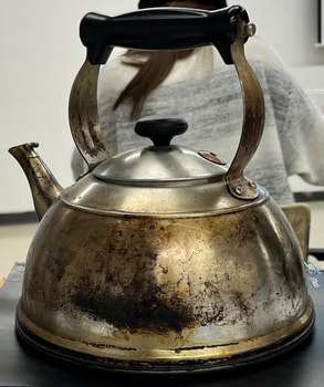 The tea kettle reference for still life artworks. 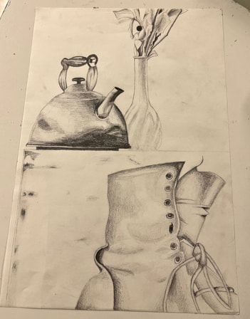 This is my drawing of the tea kettle, as well as a vase full of leaves, and the upper portion of a letter combat boot! This is my drawing of the tea kettle, as well as a vase full of leaves, and the upper portion of a letter combat boot! I thought I would post a picture of my drawing as well, just because I am really proud of it! However, as you can tell there are a lot of details on this tea kettle, lots of shading was required which means when painting this I would have to take into account the different shades of colours, certain lighting and so on. I think the most challenging part was trying to find a colour match as close to the kettle as possible!
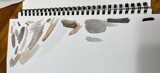
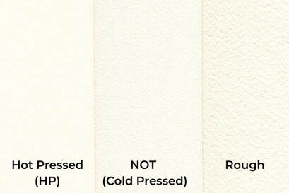
This process of creating the tea kettle used the skills I gained from each week: Week 2 - I used my knowledge of watercolour paper to choose cold-pressed paper, which is more absorbent than others. Week 3 - I used different techniques such as building layers, flat wash, graded wash, splatter paint and glazing . Week 4 - I used colour theory to mix colours throughout my painting (browns, copper tones). Week 5 - I trusted the process greatly throughout this entire project LOL. Week 6 - I used wet on wet technique, as well as my experience with still life to create highlights, shadows, and reflections. Week 7 - I used my knowledge of how to control the brush when doing linework. Week 8 - I used my knowledge of creating depth with colour, as well as when to use darker and lighter areas. If you have an interest in art, or painting, I highly suggest this medium as it is fun, challenging, sometimes frustrating, but definitely worth it in the end!
Thank you so much for following along with my learning project!
0 Comments
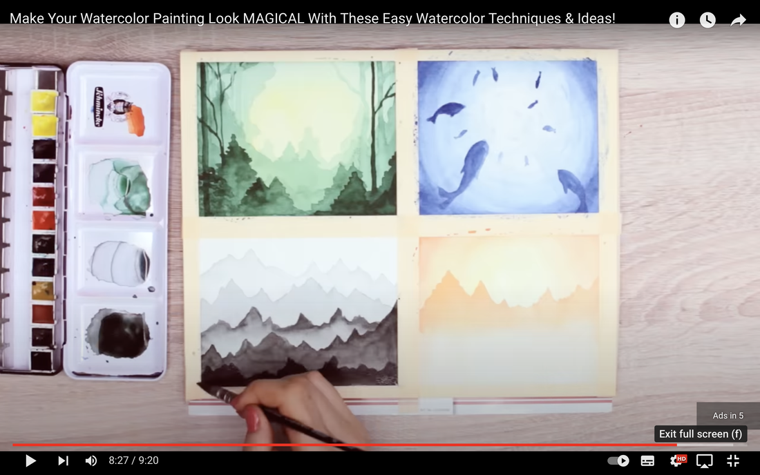
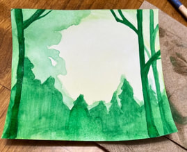
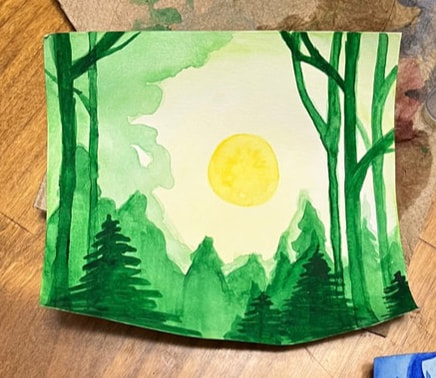
While scrolling through Youtube one day, I found a watercolour video and just couldn't pass up the opportunity to create different types of scenery! Makoccino created such beautiful paintings in her video, that I just couldn't scroll past.
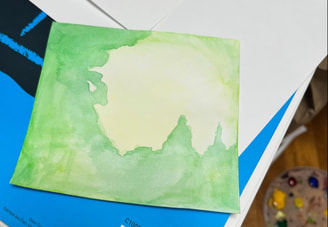
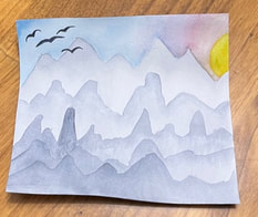
In the centre I put a little bit of yellow on my brush and blended it into the line green, this will turn into the bright yellow sun shining through the trees. I then drew a silhouette of a tree line with that same deeper green from before.
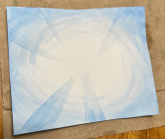
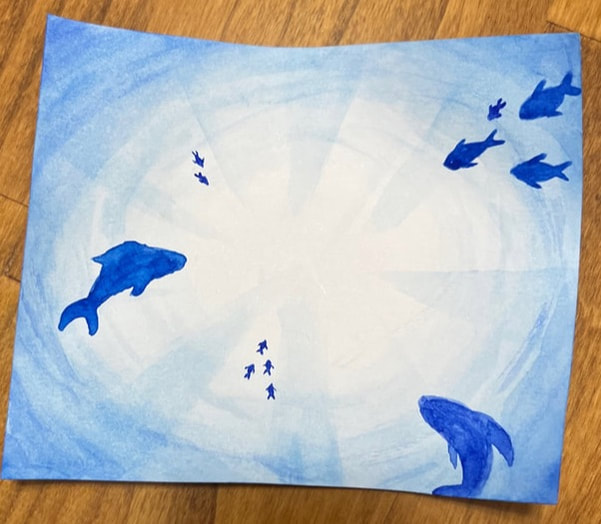
Next up, we worked on an ocean scenery. we used a monochrome palate and only used blue!
I made small curved strokes in a darker shade to create a spiral look toward the centre. We also used the blue top paint triangles which look like reflections in the water. Again, the edges will be darker, and as you pull the colour toward the middle we want it to fade to being almost invisible.
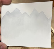
On to my last piece of the day, I did some grey mountains. In the video, Makoccino kind of just left the mountains plan, no other details, so I decided to take it upon myself to add a little more to it.
Which scenery was your favourite? I would love to hear about it in the comments below!!
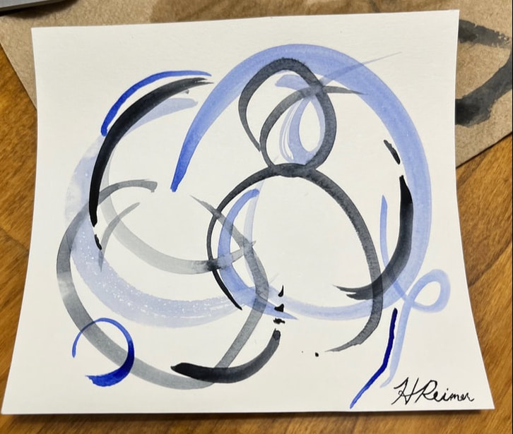
I honestly did not feel like doing anything super intricate this week. I was super busy with other assignments in different classes that when I got to this, I just wanted to take it easy and make something cute and simple that I could hang up or gift to my grandmother for her bathroom walls. So with this in mind I searched the web. I googled "watercolour ideas" which led me to a website called gather.how where it showed me a variety of different paintings I could potentially make. As I scrolled down the list, I came across an abstract painting. It intrigued me because I've never actually done an abstract art piece before, like, ever. So I really wanted to try it out. I clicked the provided link, which then took me to a blog post called, the Creativity Exchange. After reading through the post, it didn't seem so hard, the blogger explained it quite well. 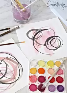 For reference this is Cyndy's thumbnail for this abstract watercolour blog post on the Creativity Exchange. What drew me to this post was not only the simplicity of the art piece, but also the elegance of her brushstrokes. I don't know what it is, but it just seemed so breath taking for only a few brushstrokes. I cut out different sizes of watercolour paper to play around with. Cyndy encourages readers to "play and explore with your watercolors," so this is exactly what I did (2016). Of course I attempted to create this version of Cyndy's artwork, but I had a lot of fun mixing colours and creating lots of similar versions as well! Disclaimer: I didn't do any progress pictures, I just had way too much fun with the linework hahaha.
I think it was a good idea to take a break from the stuff I usually paint. and a well deserved break from still life paintings like last week!
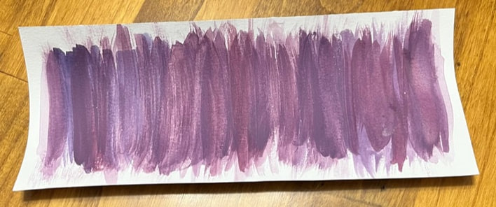
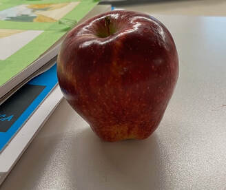
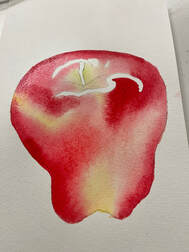
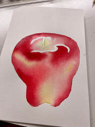
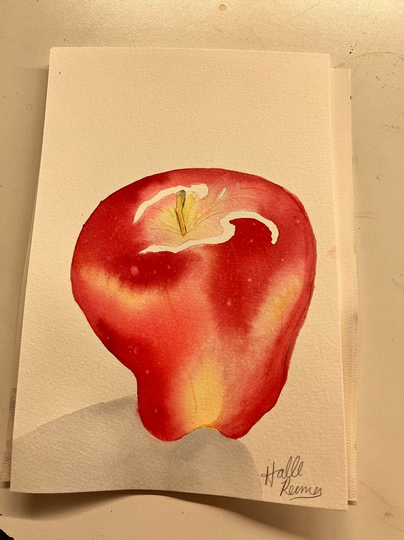
I am super happy with how these pieces turned out, I am thinking about framing them and maybe hanging them up in my cabin this summer! Let me know if you'd want to try this kind of watercolour out sometime! This week I decided to work on some still life watercolour portraits! When first looking into it, it looked super intimidating, but slowly I built up confidence to actually try it. I used two techniques that corresponded with two different YouTube tutorials.
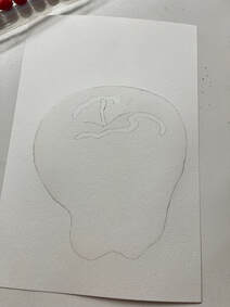
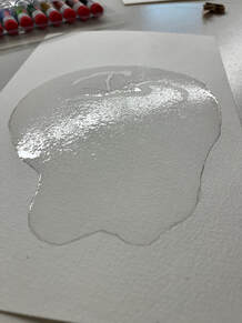
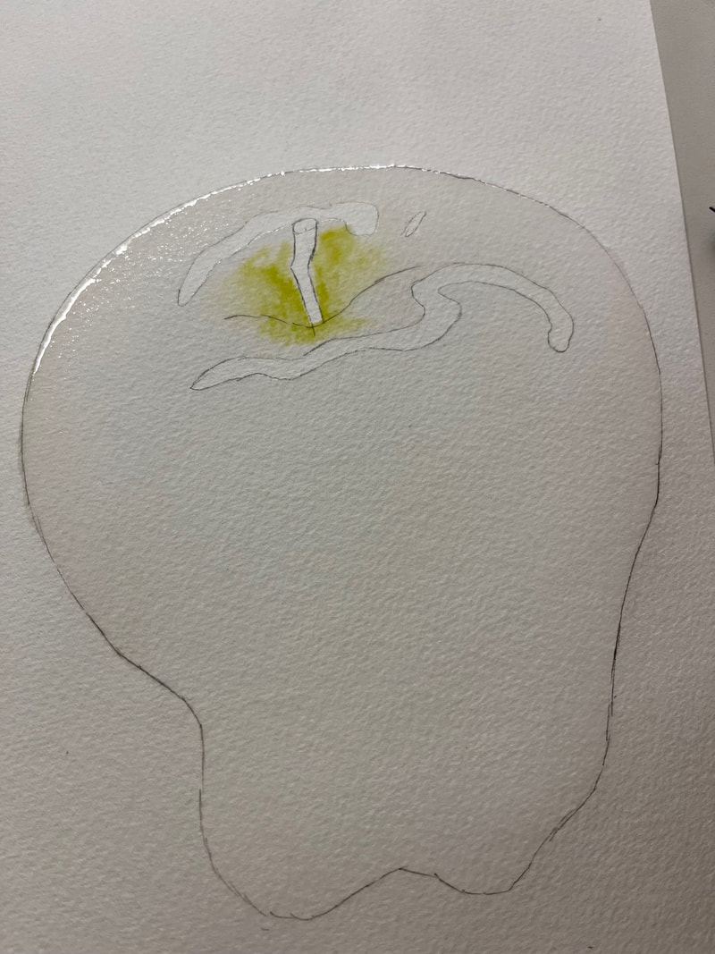
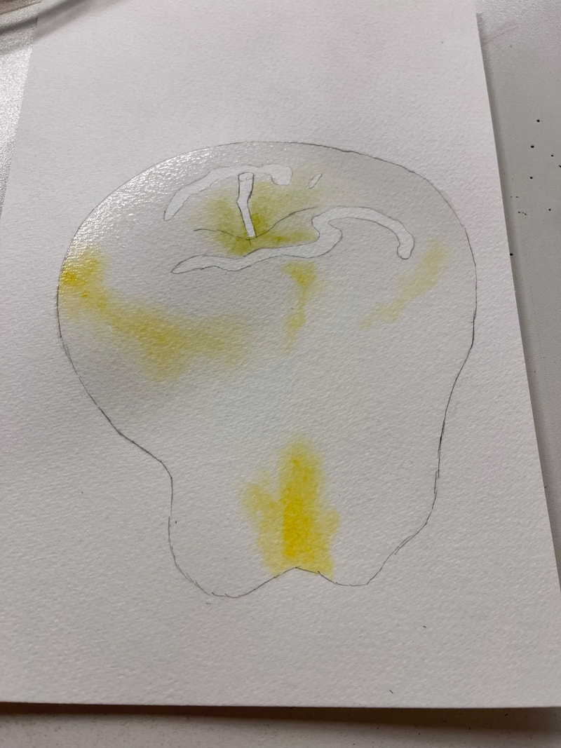
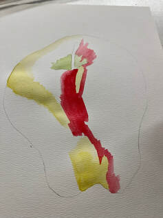
It was FINALLY time to add colour, I was extremely nervous and didn't want to mess up. Following the steps I started with the lightest colours, lime green, and yellow. I picked up water with my brush, wet the pigment to created a paint, and made sure there was less paint then water on the brush to create a light, and subtle colour. I placed them in their dedicated spots, smudged them around with the paint brush and then picked up the page so the water would move the colour around on my page.
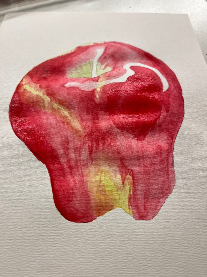
Finishing steps were to add details. This meant painting the stem of the apple, adding the spots, cleaning up the lines, and adding a shadow.
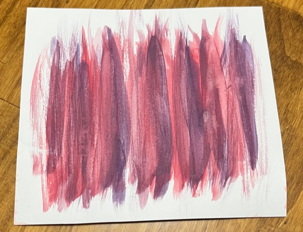
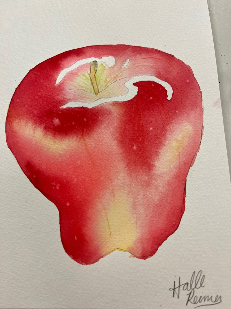
Now for the wet on dry technique. LET ME TELL YOU, this was much harder than wet on wet. I found it much harder to blend it, much harder to make everything even as I felt like everything was drying very quickly. Maybe that was my fault cause I was definitely using a much smaller brush so it probably wasn't able to hold nearly as much water or paint.
I once again started with the lighter colours, green and yellow. Looking back, I am wondering if maybe I used more pigment, and less water than I should have. But hey, this is a LEARNING project, it's okay to make mistakes. After the light colours, I once again moved onto the red. I had a heck of a time blending colours once they dried, and attempted to re-wet the colour already on the paper, this kind of just picked up the paint and made it look blotchy.
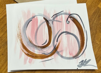
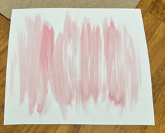
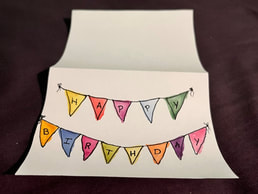
This week is a special week for my family as we have a ton of birthdays all in a row, and what better way to celebrate a birthday on a budget! I went to YouTube to try and find some fun and creative birthday card ideas and I was not disappointed with what I found. Unfortunately, I was WAY too into the artsy fartsy crafts to take progress photos! I screwed up!! SORRY! The Happy Ever Crafter had a super cute and fun card tutorial that left me in awe with what I could do myself. We began by cutting out a square and folding it in half to create the card. For stability, I taped down my card so it wouldn't move on me, but she did not. She then used some techniques I have already learned, such as using masking tape to create a boarder or open space within the painting. In this case we placed a line of masking tape horizontally across the card. We then began free handing candles, which was a little scary for me at first, as I did not want to make mistakes, but I trusted the process! To keep it simple she just painted right over the tape which I found caught a lot of the paint and made a dark line around the tape, but I just emptied my brush of paint, dried it and went over the dark line to soften it a bit. During the video she mentioned that if you get a smudge of paint on the paper where you don't want it, to grab a wet piece of paper towel and wipe it off while the paint is still wet! this tip became a life saver for me towards the end because the paint on the tape got a little messy... oops. We started overlapping candles and she mentioned that we should wait until the first candle is COMPLETELY dry, well... I was a little impatient and my two colours blended together a little bit! At first I was a little upset and discouraged and honestly just wanted to restart, but as it dried it honestly wasn't that noticeable. So I suppose the real lesson was to TRUST THE PROCESS, haha. The Happy Ever Crafter then went on to detail the candles further by drawing different patterns on them, but I wanted to stop where I was at, I was more than happy with how this card turned out and I'm quite proud of myself! Finally I finished my card by handwriting "Happy Birthday" where the masking tape was previously 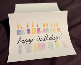 Next up I decided to take a break from YouTube, and took a look at Pinterest. On pinterest I found a cute banner card that I just HAD to make, pictured below. 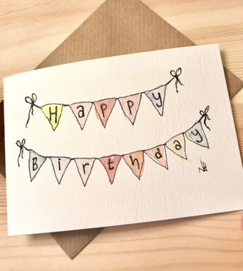 https://pin.it/56ggUej
For the next attempt, I made the banners a little smaller AND I planned out in pencil where each banner would go. I learned from my mistakes people!! I began by drawing a messy line about 1/3 of the way down from the top, and another longer messy line about 2/3 the way down from the top. I then made squiggly triangles (redrawing them if needed, so they were to my liking) and made sure to spread them evenly-ish across the banner string. Then I began painting. I also like this card a little more because I even made sure to make the colours less dark and concentrated, and in my opinion it just seems a little more inviting to open. But maybe that's just me. To finish I outlined the banners and drew little strings with bows and wrote each letter of "Happy Birthday" in the flags. 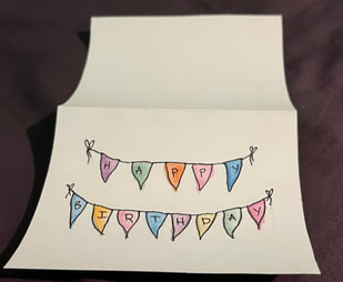 My final card for this week was sort of a disaster, my nephew woke up from his nap, so I rushed through it and I guess I didn't learn my lesson because I ended up free-handing it again. *insert face-palm* Now this card was also found on Pinterest, but mostly used it as inspiration, and did my own little twist!  https://pin.it/51Bfvxs I really loved the simplicity of the circles and the writing. So I decided that I would create a card with 13 circles one for each letter of "Happy Birthday," I feel like if I had more time and less distraction, it would have turned out a little different haha. But either way it was a card, and its the effort that counts! 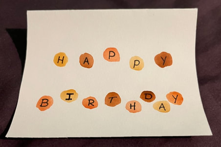 Although the circles didn't turn out exactly how I wanted and the letters are a little quirky, lets say, I absolutely loved how my colours turned out that, not to toot my own horn, I mixed myself and they actually look great together! So seeing the light in the dark, I am very proud of what I have achieved this week. I enjoyed the process, and most of the outcomes and all of these will be put to good use!
Now that I've got a handle on the skills and techniques of watercolour, I want to work on colours. More specifically mixing colours and finding complementary and opposite colours.. Really just getting down to the basics of colour theory. The content creator, Makoccino, makes note that mixing all the primary colours red, yellow, and blue will make a pigment really close to black because all three of these colours neutralize each other. Whereas when you mix the three primary colours between each other (red to blue, blue to yellow, yellow to red) they create not only the secondary colours, orange, green, and purple, but they also make tertiary colours such as red-orange, yellow-orange, blue-purple, red-purple, blue-green, or yellow-green. Later in the video, Makocinno challenges the idea that there are really no TRUE primary colours, that every one is biased toward either the warmer or cooler tones. This causes some secondary and tertiary colours to be either more dull or more vibrant. In order to differentiate you need to ask yourself if the underlying undertones in yellow are more green or more orange, If your red is a little more purple or more orange, and if your blue is a little more purple or green. these undertones will allow you to decipher if your colour is warmer or cooler toned. Below you will see that my primary colours are all warm toned. 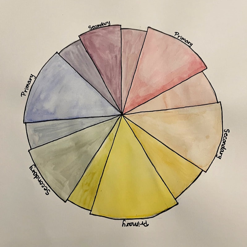 Here, I show my very own colour wheel, that I created. unfortunately the paint sets I purchased do not have greens, oranges or violets. So my green, orange and purple will always have to be mixed each time its needed, which could make significant differences in my art pieces if I end up needing to make more of a specific colour! While I was working on this colour wheel, I was worried I was going to get too much water or too much pigment on the paper, and for the yellow I think I found a good middle ground, but the others I don't think I had enough paint on my brush. However, it didn't look this way when it was wet.. but the great thing about watercolour is that you can always build up the colour! Makoccino then goes on to explain that the colours directly across from each other on the colour wheel are complimentary colours. This means that when you paint them next to each other they will make each other stand out more and intensify the colours. BUT if you mix those two complimentary colours together, it will create a brownish colour, if they are true complimentary colours and the ratio of, for example blue and orange, is equal, then together these colours will create a grey. Below you will see I made three "scales" and put the primary colours towards the top and the secondary colours on the bottom. the goal was to show what happens when I add complimentary colours together. In the top squares I made the ratio 1:0 for primary colours, then 3:1, 3:2, 3:3, and then I started from the secondary colour and did 1:0, 3:1, 3:2 towards the middle. 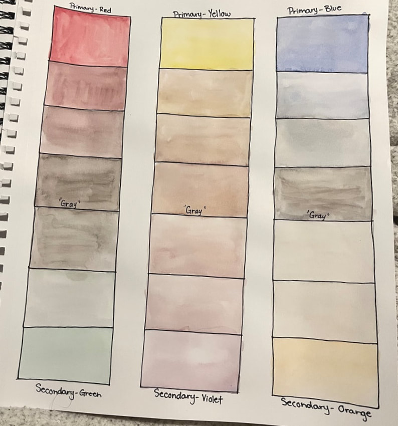 Though many of my colours aren't very visible in the photo, you can see the (not so subtle) gradient between the colours that either meet in the middle to become a grey or brownish colour, which was my goal! Overall, this experiment with colour theory was successful! I learned a lot about primary, secondary, and tertiary colours and how when different colours and colour tones are mixed together we get many different outcomes.
This week I decided to not only explore YouTube and iMovie, but also try out some interesting watercolour techniques. For this activity I looked up some techniques online to attempt. I started off this project by taping off the edges to not only create a boarder but to keep my page in one spot and do my best to keeping the paper from lifting. I then taped off a grid so I could practice each technique on one piece of paper as I do not want to waste any of it. I wrote down techniques I found on a blog site, read the descriptions of how to achieve each one, and got to work! This Time-lapse of my technique exploration was created using a iPhone, iMovie, and YouTube! I shot the footage on my phone, put it through iMovie, played around with it to make the video just right, and then uploaded it to YouTube. 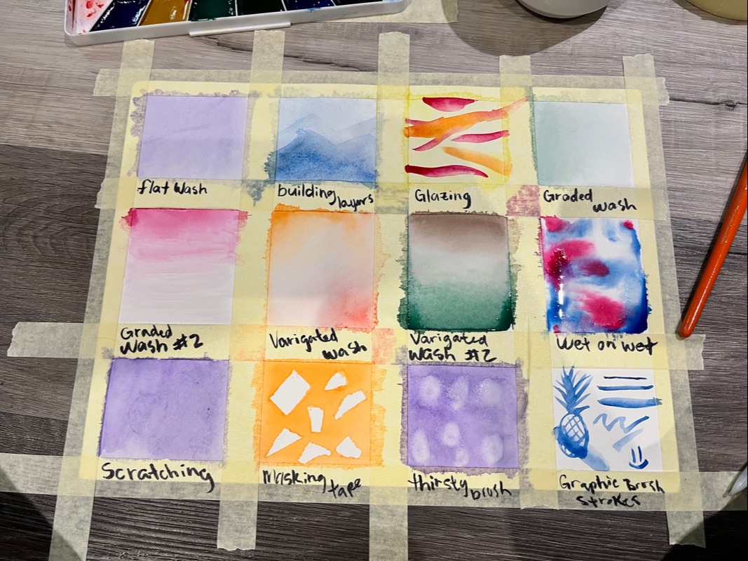 My first technique was a flat wash, and trust me, it is ALOT harder than it looks to create a flat background or wash. The blog said it was one of the simplest techniques and boy was I let down. My flat wash ended up having an uneven finish, but when I did a flat wash for the building layers, and glazing techniques it turned out a bit better than the first try. 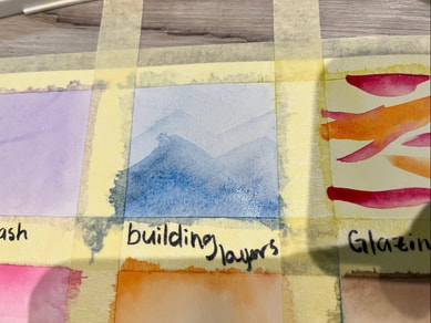 Building layers and glazing needed a bit of time in-between each layer so I did them first as I could go back to them in-between the rest of the squares I painted. I would do a layer and then work on another technique, build a layer then move on to another technique, and so on. In the end I didn't leave enough time between the second and third layer in the building layers square. but my glaze technique turned out well I let the flat wash layer dry for a while and then dipped into vibrant colours to glaze overtop The graded and variegated washed were quite similar, graded was simply just one colour in a gradient, and variegated was two coloured used on opposite sided of the square that gradually met in the middle to create a gradient from one colour to another. 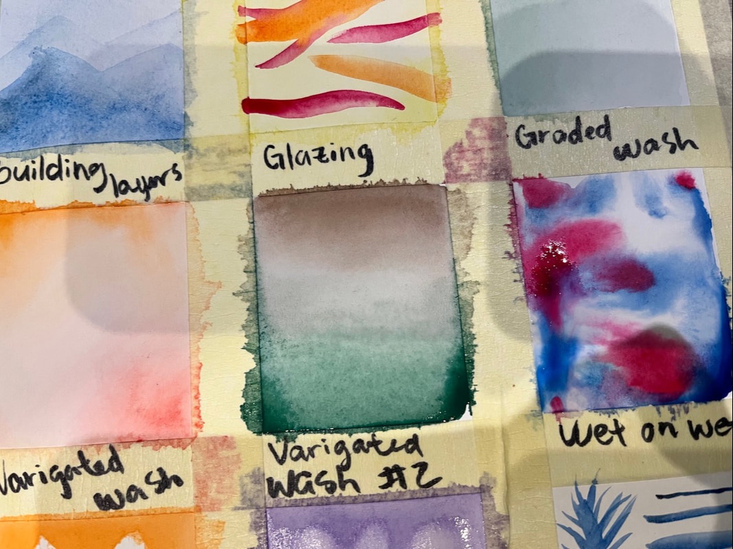 My wet on wet looked super pretty when I first played down the paint, but as it was drying the paint spread out and everything kind of looked less pretty.. from my perspective. I think I may have added a little too much water, so as I practice I will keep that in mind, and find another approach to this technique with less value/intensity. My brother wondered what would happen if I scratched an image into the paper and painted over it, we thought maybe the paint would pool into the crevasse and appear darker than the background. At first our hypothesis was appearing to be true, but as the paint dried, it all looked the same colour and as you can see in one of the previous photos, you can hardly see the heart I drew in it. It was a creative, yet disappointing experiment!
I then went back to the website and saw a masking tape technique, I ripped up some take placed it down making sure it was secure to the paper and nothing would leak under. I then painted it a vibrant orange so we could clearly see if it leaked underneath and I was ecstatic with the result! On a larger scale I think this technique could be used to create a very interesting art piece. My second last technique was thirsty brush, this one I named myself, because I wanted to see if I could lift some of the wet paint from the paper to create a cool effect. I took a dry brush and rubbed it on the paper in a circle to pull some of the colour off the page. it didn't work as well as I would have liked but it worked decently nonetheless. Finally, I wasn't to play around with the different strokes a singular brush could make, thin lines, thick lines, curly lines, straight lines, and all types of lines in-between. Overall, this activity taught me a lot about how I can control not only my brush but the value of colour being put onto the page as well. I think practicing these techniques is a great way for a beginner like myself to become more comfortable with this medium of art.
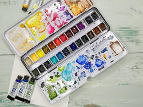
Hello there, and welcome to my blog! Here, I will be writing about my journey of learning how and hopefully improving my skills in watercolour. So far, my experience with watercolour is very minimal. I have always loved arts and crafts, but I have much more experience with acrylic paint and other mediums such as graphite, and even clay. I know that watercolour is vastly different from acrylic paint, but I think it is interesting that there are different ways to go about working with watercolour, techniques such as using a wet surface or using a dry surface, and layering the colour on to build up more intense colours. I look forward to exploring different techniques, and sharing my newfound knowledge with you all!
|
Halle ReimerThis blog page is where I will document and reflect on my personal learning project. Here I will tell you my initial knowledge of watercolour paint and, in time, what I have learned over the course of the next few weeks I spend working on my watercolour paint skills. |
 RSS Feed
